
The Physio Room Raglan
A fresh, clean, minimalist rebrand that captures the clinic's coastal influences and expertise. Needing a brand that matches its growth and expert care, the outcome captures a younger audience while keeping long-time clients loyal.
Client
The Physio Room Raglan
Date
2023
Role and Outputs
Logo, Brand Identity
The Physio Room Raglan is a physiotherapy clinic in Raglan, New Zealand. Their team consists of specialists with diverse expertise, allowing them to provide tailored care for each individual. They use a holistic approach that combines pilates and acupuncture with hands-on treatment to assist clients in reaching their health objectives.
The clinic has expanded to three locations due to positive word-of-mouth and required a rebranded image to mirror its growth and extended influence.
Project Goals:
- Establish clear brand recognition to stand out in the local healthcare market.
- Differentiate from competitors and avoid confusion with similarly named clinics.
- Appeal to a younger demographic without alienating the clinic's core audience.
- Refresh the brand's visual identity while maintaining trust and familiarity for loyal clients.
Project Challenges:
- Competitor Confusion: Despite their strong reputation and prime locations, clients often confuse The Physio Room Raglan with other healthcare professionals, such as osteopaths, chiropractors, and nearby clinics.
- Balancing Youthfulness with Trust: The clinic needed a youthful, modern image to attract new clients while retaining the trust and loyalty of its long-time clientele.
- Market Competition: There is a need to stand out in a competitive landscape with other healthcare providers offering overlapping services.
The rebranding solution centred on developing a clean, minimalist logo and visual identity that reflects the clinic's core values: accurate diagnosis, exceptional care, and a welcoming, holistic environment.
Key Design Elements:
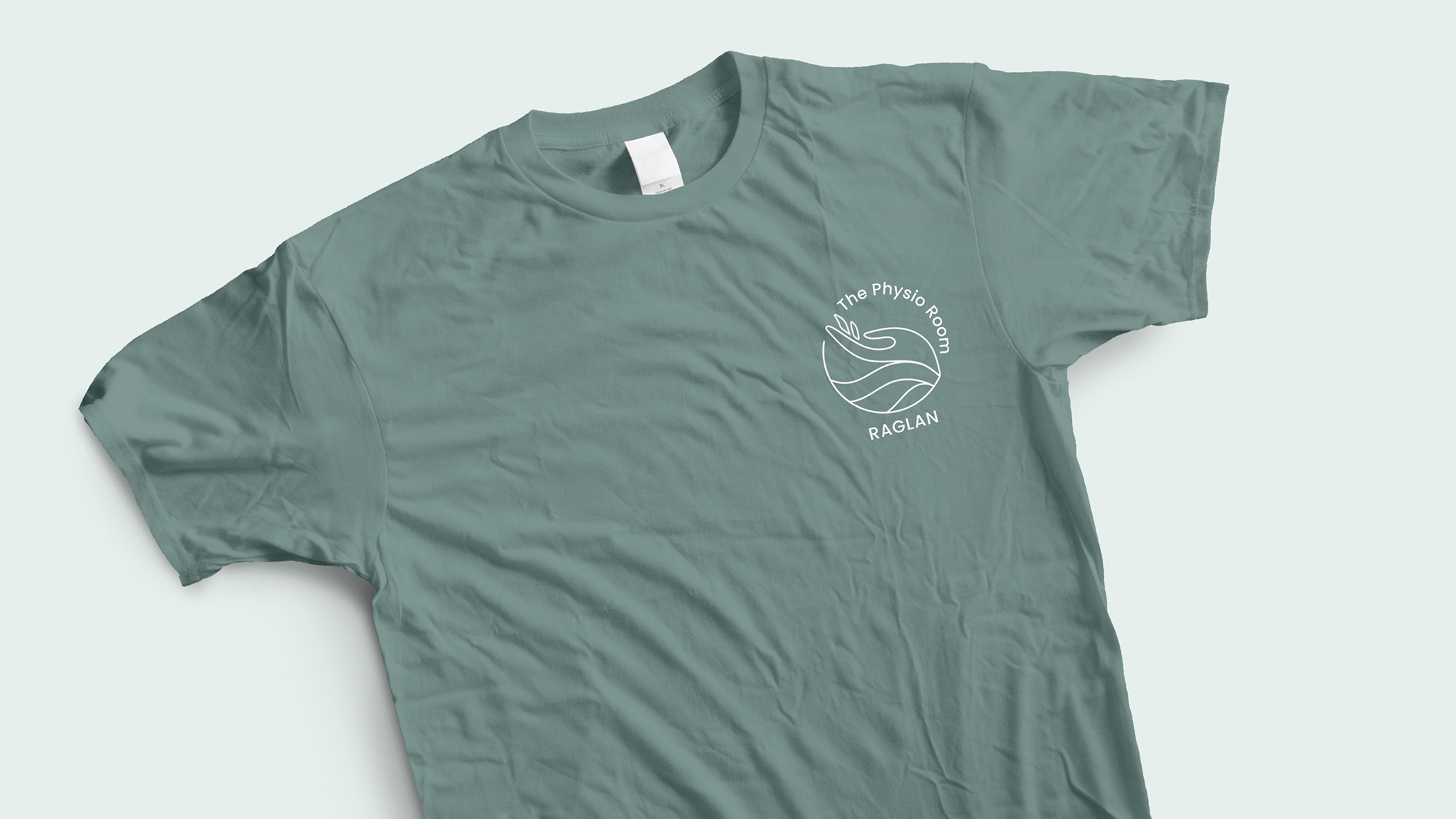
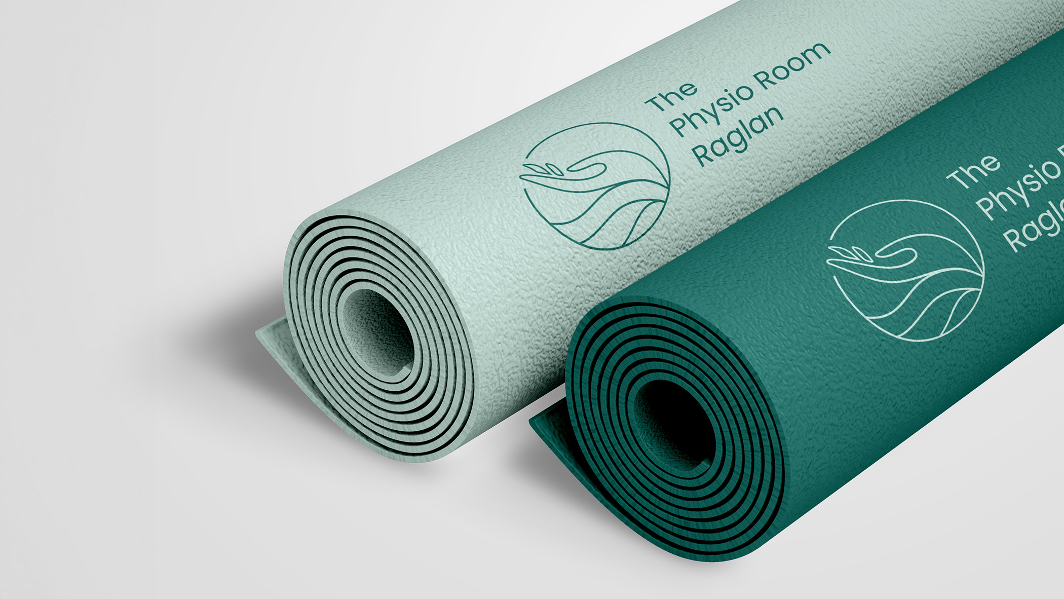
- Logo Design: The logo was crafted to blend the essence of Raglan's coastal identity with the clinic's expertise in physiotherapy and rehabilitation. It embodies movement, healing, and the clinic's holistic approach, making it approachable yet professional.
- Colour Palette: A calm and soothing mint, olive, and green turquoise colour scheme was selected. These colours communicate professionalism and serenity, appealing to a broad range of clients, from long-time loyalists to a younger, health-conscious audience.
- Minimalist Visual Identity: A clean, simple aesthetic was adopted to ensure clarity and strong brand recognition, making the brand easily recognisable across digital and physical spaces.
The final design successfully bridged the clinic's need for a modern, youthful appeal and the trust of its existing client base.


The Physio Room Raglan
A fresh, clean, minimalist rebrand that captures the clinic's coastal influences and expertise. Needing a brand that matches its growth and expert care, the outcome captures a younger audience while keeping long-time clients loyal.
Video created by Sarah Gudsell
Client
The Physio Room Raglan
Date
2023
Role
Logo, Brand Identity
The Physio Room Raglan is a physiotherapy clinic in Raglan, New Zealand. Their team consists of specialists with diverse expertise, allowing them to provide tailored care for each individual. They use a holistic approach that combines pilates and acupuncture with hands-on treatment to assist clients in reaching their health objectives.
The clinic has expanded to three locations due to positive word-of-mouth and required a rebranded image to mirror its growth and extended influence.
Project Goals:
- Establish clear brand recognition to stand out in the local healthcare market.
- Differentiate from competitors and avoid confusion with similarly named clinics.
- Appeal to a younger demographic without alienating the clinic's core audience.
- Refresh the brand's visual identity while maintaining trust and familiarity for loyal clients.
Project Challenges:
- Competitor Confusion: Despite their strong reputation and prime locations, clients often confuse The Physio Room Raglan with other healthcare professionals, such as osteopaths, chiropractors, and nearby clinics.
- Balancing Youthfulness with Trust: The clinic needed a youthful, modern image to attract new clients while retaining the trust and loyalty of its long-time clientele.
- Market Competition: There is a need to stand out in a competitive landscape with other healthcare providers offering overlapping services.
The rebranding solution centred on developing a clean, minimalist logo and visual identity that reflects the clinic's core values: accurate diagnosis, exceptional care, and a welcoming, holistic environment.
Key Design Elements:
- Logo Design: The logo was crafted to blend the essence of Raglan's coastal identity with the clinic's expertise in physiotherapy and rehabilitation. It embodies movement, healing, and the clinic's holistic approach, making it approachable yet professional.
- Colour Palette: A calm and soothing mint, olive, and green turquoise colour scheme was selected. These colours communicate professionalism and serenity, appealing to a broad range of clients, from long-time loyalists to a younger, health-conscious audience.
- Minimalist Visual Identity: A clean, simple aesthetic was adopted to ensure clarity and strong brand recognition, making the brand easily recognisable across digital and physical spaces.
The final design successfully bridged the clinic's need for a modern, youthful appeal and the trust of its existing client base.


Disinterested non-voter
Principled non-voter
Engaged non-voter
Inconvenienced non-voter

The Physio Room Raglan
A fresh, clean, minimalist rebrand that captures the clinic's coastal influences and expertise. Needing a brand that matches its growth and expert care, the outcome captures a younger audience while keeping long-time clients loyal.
Client
The Physio Room Raglan
Date
2023
Role
Logo, Brand Identity
The Physio Room Raglan is a physiotherapy clinic in Raglan, New Zealand. Their team consists of specialists with diverse expertise, allowing them to provide tailored care for each individual. They use a holistic approach that combines pilates and acupuncture with hands-on treatment to assist clients in reaching their health objectives.
The clinic has expanded to three locations due to positive word-of-mouth and required a rebranded image to mirror its growth and extended influence.
Project Goals:
- Establish clear brand recognition to stand out in the local healthcare market.
- Differentiate from competitors and avoid confusion with similarly named clinics.
- Appeal to a younger demographic without alienating the clinic's core audience.
- Refresh the brand's visual identity while maintaining trust and familiarity for loyal clients.
Project Challenges:
- Competitor Confusion: Despite their strong reputation and prime locations, clients often confuse The Physio Room Raglan with other healthcare professionals, such as osteopaths, chiropractors, and nearby clinics.
- Balancing Youthfulness with Trust: The clinic needed a youthful, modern image to attract new clients while retaining the trust and loyalty of its long-time clientele.
- Market Competition: There is a need to stand out in a competitive landscape with other healthcare providers offering overlapping services.
The rebranding solution centred on developing a clean, minimalist logo and visual identity that reflects the clinic's core values: accurate diagnosis, exceptional care, and a welcoming, holistic environment.
Key Design Elements:
- Logo Design: The logo was crafted to blend the essence of Raglan's coastal identity with the clinic's expertise in physiotherapy and rehabilitation. It embodies movement, healing, and the clinic's holistic approach, making it approachable yet professional.
- Colour Palette: A calm and soothing mint, olive, and green turquoise colour scheme was selected. These colours communicate professionalism and serenity, appealing to a broad range of clients, from long-time loyalists to a younger, health-conscious audience.
- Minimalist Visual Identity: A clean, simple aesthetic was adopted to ensure clarity and strong brand recognition, making the brand easily recognisable across digital and physical spaces.
The final design successfully bridged the clinic's need for a modern, youthful appeal and the trust of its existing client base.
The Physio Room Raglan
A fresh, clean, minimalist rebrand that captures the clinic's coastal influences and expertise. Needing a brand that matches its growth and expert care, the outcome captures a younger audience while keeping long-time clients loyal.
Client
The Physio Room Raglan
Date
2023
Role & Outputs
Logo, Brand Identity
The Physio Room Raglan is a physiotherapy clinic in Raglan, New Zealand. Their team consists of specialists with diverse expertise, allowing them to provide tailored care for each individual. They use a holistic approach that combines pilates and acupuncture with hands-on treatment to assist clients in reaching their health objectives.
The clinic has expanded to three locations due to positive word-of-mouth and required a rebranded image to mirror its growth and extended influence.
Project Goals:
- Establish clear brand recognition to stand out in the local healthcare market.
- Differentiate from competitors and avoid confusion with similarly named clinics.
- Appeal to a younger demographic without alienating the clinic's core audience.
- Refresh the brand's visual identity while maintaining trust and familiarity for loyal clients.
Project Challenges:
- Competitor Confusion: Despite their strong reputation and prime locations, clients often confuse The Physio Room Raglan with other healthcare professionals, such as osteopaths, chiropractors, and nearby clinics.
- Balancing Youthfulness with Trust: The clinic needed a youthful, modern image to attract new clients while retaining the trust and loyalty of its long-time clientele.
- Market Competition: There is a need to stand out in a competitive landscape with other healthcare providers offering overlapping services.
The rebranding solution centred on developing a clean, minimalist logo and visual identity that reflects the clinic's core values: accurate diagnosis, exceptional care, and a welcoming, holistic environment.
Key Design Elements:
- Logo Design: The logo was crafted to blend the essence of Raglan's coastal identity with the clinic's expertise in physiotherapy and rehabilitation. It embodies movement, healing, and the clinic's holistic approach, making it approachable yet professional.
- Colour Palette: A calm and soothing mint, olive, and green turquoise colour scheme was selected. These colours communicate professionalism and serenity, appealing to a broad range of clients, from long-time loyalists to a younger, health-conscious audience.
- Minimalist Visual Identity: A clean, simple aesthetic was adopted to ensure clarity and strong brand recognition, making the brand easily recognisable across digital and physical spaces.
The final design successfully bridged the clinic's need for a modern, youthful appeal and the trust of its existing client base.
Phase 1
phase 2
phase 3
phase 4


Model
Render
We came to Poppy with a tired old logo, something that had never had any real brand thinking behind it, and it showed….She brings genuinely fresh eyes, thinks for herself, and challenges you in the most un-challenging, collaborative way. Her process is seamless, she draws out the gold from you quickly, layers her expertise on top, and somehow makes it all feel effortless. The result? A brand that finally reflects the quality of our product and the kind of customers we actually want to attract. It’s elegant, clear, and just works. Since launching, we’ve seen a real shift in the kinds of customers engaging with us, the brand is doing the heavy lifting. "
Ange Wallace
Other projects

Blueprints of Self
